Monday, December 31, 2007
Friday, December 28, 2007
Architectural Dislike #7: Long Walks from Green to Tee
 The two most important parts of designing and building a golf course are starting (the routing plan) and finishing. A good routing almost always keeps the holes close to each other with short green to tee walks. It provides an intimate setting and facilitates keeping a continuity while playing. The time to reflect and enjoy ones time on the course is when walking from the hitting spot to where the ball comes to rest.
The above picture is from a very memorable round I played a few years ago. I highlighted the ride from a green to the next tee. I say ride as it is an impossible course to walk. It was incredible the number of long walks on the course, which in great part lead to this being one of the worst courses I've ever seen.
Wolf Point's total walk from the first tee to the 18th green is approximately 4.3 miles. The walks from green to tee are miniscule. For reference the above pictured course's walk would have been above 7 miles - if one was allowed to walk.
Friday, December 21, 2007
Architectural Dislike #6: Golf Stuff
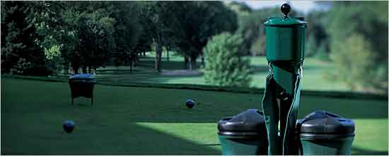 I sure wish there was no stuff on a golf course. There isn't at Wolf Point -- every visible outside element takes me further away from the game. I vividly recall once using a ball washer as a target on one of the finest holes in the world. It helped me hit a great shot but left an aftertaste. It has been a goal to avoid as many visual distractions as possible: grass lines, trash cans, cart paths, irrigation satellites, tee markers, the pump station, rakes and ball washers especially.
Thursday, December 20, 2007
Architectural Dislike #5: Small Ponds
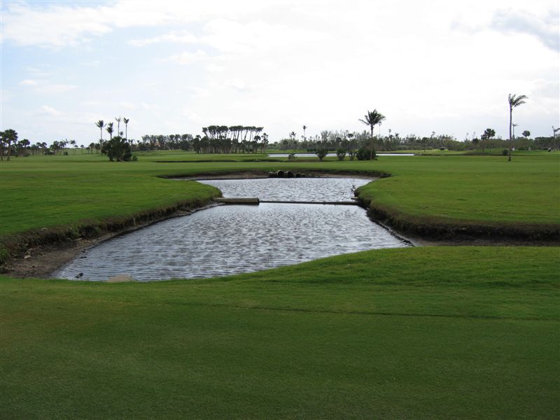 Ponds as small as a bunker! I also mean the ones a little bigger too. I've seen lots of those, especially in Texas and Florida. Yes they are used as collection spots to drain to and then later overflow into larger areas. Yes they can be needed on flatter sites. But they don't have to be directly in play. Only one time have I seen a small pond look bigger - due to the geometry and the plantings.
There is not mistaking what we created at Wolf Point - it is a big pond (13 acres) and a setting in itself not just trying to add to the existing setting. It is very peaceful watching the choppy water and feeling the breeze at the end of a long day.
Wednesday, December 19, 2007
With my 100th post comes my first blog award...
 The following quote is from an esteemed friend at Golf Club Atlas.
 Golf Blog of the year
The Naffy goes to-------- >Tie (Ian Andrew's Caddy Shack and Mike Nuzzo)
People who read blogs, really don't like reading. In reality I think they just require visual stimulation first. As a rule, I stay away from blogs full of self promotion or those that are trying to highlight themselves. It is part of the reason I don't have a blog, why listen to a hardbag winge? Ian Andrew is a bloggist who is not afraid to shoot from the lip and moreover he's a wonderful writer and golf architect. Ian's lists and the rationale behind them are fodder for many a discussion over a few beers. If I've learned anything from him, it is this--Truly it is heinous to rank anything in the golf architecture business but a necessary evil that I cannot like Jessica Alba keep my eyes off of. His compilations are superb.
Yet, I will make bold to say, Ian cannot share the Naffy alone. Mike Nuzzo's tag is a horseshoe perhaps not because he works out of Texas but because just knowing him is good luck. Mike can you feng shui my house? I have followed his new project which is the subject of his blog daily. It truly is a wonderful look into what it takes to build a course on a daily basis. If you ever wanted to know how difficult and thrilling it can be at the same time with some one who is on site every day, then read Mike's blog.
Sunday, December 16, 2007
Architectural Dislike #4 : Swoopy
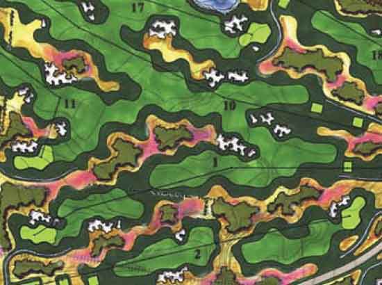 I hate swoopy. Swoopy is the term I use for a regular wavey shape. Swoopy fairway lines are often used to create artificial interest in fairways where there is no interest. Or the grassing lines are made swoopy to go around the artificial containment mounding. Greens are made swoopy for the same reasons too, and bunkers while usually a different swoop frequency are still swoop to me. The picture above has all the swoops swooped into one.
There is no swoop at Wolf Point. The interest comes in the form of three dimensional irregular movement - rumples and waves.
Friday, December 14, 2007
Who's There
Tuesday, December 11, 2007
The 6th Hole - A Found Golf Hole
As promised - Don Mahaffey is today's guest writer:
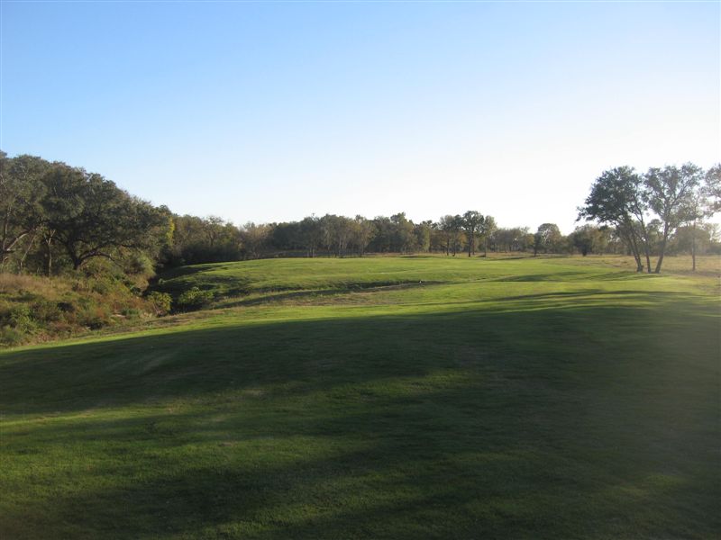 One of my favorite holes on our golf course is the 6th hole. I love this hole because it is so subtle and so simple -- and because it required very little work -- I already had enough work to do! It is a par 3 that can play from 210 to 135 yards. It plays almost due south. The prevailing wind is from the south east and is into the player at about the 10 o’clock angle.
By far the hardest part about building this hole was having the courage to just leave it alone. We debated this a lot as the original plan called for a couple of bunkers to be added and shaped. But as we cleared the few trees and light brush in the area it became even more obvious that very little work was required for this to be a fine golf hole. The hole has a creek hazard running up the entire left side and behind the left portion of the green. Since the lay of the land is sloping right to left, the creek is very much in play and additional hazards were not needed. The green slopes hard to the left and the back half falls away to the creek behind.
Mike has his own modern architectural dislikes, and I don’t have the patience to come up with 10 at this time, but chief among mine is the fact that I believe most architects would have felt the need to “spruce up” this hole, if only so it photographed better. Or they feel the need to “copy” holes that were built over a century ago by architects who worked with the ground they were given. If we need to copy anything from the past, we should be looking at the processes they used to create great holes with the land they had to work with. Our 6th hole represents the type of architecture that I love, and find lacking in most modern work; simple, subtle, yet very challenging. I’m very proud of the work (or lack of) we did to create this hole.
 One of my favorite holes on our golf course is the 6th hole. I love this hole because it is so subtle and so simple -- and because it required very little work -- I already had enough work to do! It is a par 3 that can play from 210 to 135 yards. It plays almost due south. The prevailing wind is from the south east and is into the player at about the 10 o’clock angle.
By far the hardest part about building this hole was having the courage to just leave it alone. We debated this a lot as the original plan called for a couple of bunkers to be added and shaped. But as we cleared the few trees and light brush in the area it became even more obvious that very little work was required for this to be a fine golf hole. The hole has a creek hazard running up the entire left side and behind the left portion of the green. Since the lay of the land is sloping right to left, the creek is very much in play and additional hazards were not needed. The green slopes hard to the left and the back half falls away to the creek behind.
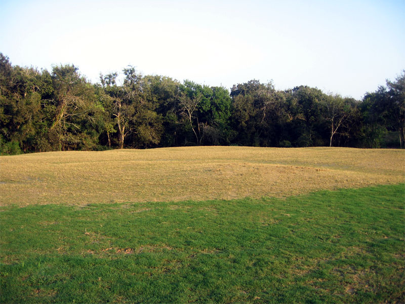
Mike has his own modern architectural dislikes, and I don’t have the patience to come up with 10 at this time, but chief among mine is the fact that I believe most architects would have felt the need to “spruce up” this hole, if only so it photographed better. Or they feel the need to “copy” holes that were built over a century ago by architects who worked with the ground they were given. If we need to copy anything from the past, we should be looking at the processes they used to create great holes with the land they had to work with. Our 6th hole represents the type of architecture that I love, and find lacking in most modern work; simple, subtle, yet very challenging. I’m very proud of the work (or lack of) we did to create this hole.
Don Mahaffey
Golf Course Superintendent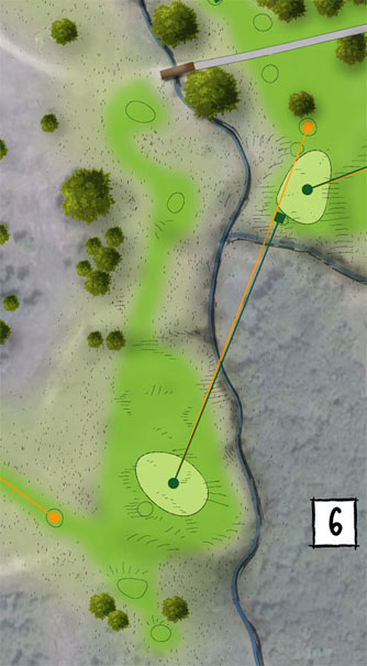
The 6th Hole - A Redan?
 I've seen and played several Redans*. "The Redan" at North Berwick, Chicago, Shore Acres, Shinnecock, NGLA, The Knoll, Pacific Dunes, Apache Stronghold and many other variants of varying quality (all those links are to aerials of the Redans - give 'em a click). The primary features are a green that runs away from the player with a fortress type bunker flanking the front and usually back of the green. None of the green complexes I listed above are completely similar, and frankly I don't think any of them look much like the original Redan.
The above illustration is the original layout of the 6th hole at Wolf Point. I visualized this hole early on in the routing process. The green site was surrounded in the back by a drainage way and the creek protects the entire left side. I struggled whether to make it a "real" Redan or to have a similar strategy or not at all. Don would suggest to ignore the fact that there ever was a Redan and we'll just make the hole as good as we can. Tomorrow I'm going to have Don guest host and explain why the 6th is one of his favorites.
Earlier Holes Featured: 1 - 2 - 3 - 4 - 5 - 7 - 8 - 9 - 10 -11 - 12 - 13 - 14 - 15 .
*If you would like to read more about the history or the redan pick up the following book: The Evangelist of Golf by my friend George Bahto.Wednesday, December 5, 2007
December Sharp Sweet Dusk Air
 Tonight the course was so beautiful I decided to take a brief intermission from my top 10 and share. I was at a spot I haven't photographed before -- directly behind the 12th green looking across the 11th & 2nd fairways towards the 3rd green in the distance. It was a beautiful day today and I sat for a while in this spot and enjoyed our progress and the sharp sweek dusk air.
Tuesday, December 4, 2007
Architectural Dislike #3: Truncated Cone Tees
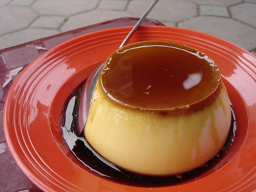 Again I'm a bit at a loss for a good picture to illustrate my dislike. I should note to collect more pictures of what I don't like to share with future clients and shapers. So in doing a web search for truncated cone - the above picture turned up - which is far more appetizing than as a tee.
There was and is a predisposition for the golfer to want to see the entire hole when on the tee. Hence the popularity of the elevated tee. I do not like when all 4 or 5 tees are separate land forms that all look like volcanoes. They are artificial looking, hard to climb, harder to maintain and build and they can posses a safety risk. I think their overuse is indicative of a poor routing plan. You won't see any of these at Wolf Point Club.
Pictured is a Crème brûlée.
Architectural Dislike #2: Bunkers that require mechanical rakes
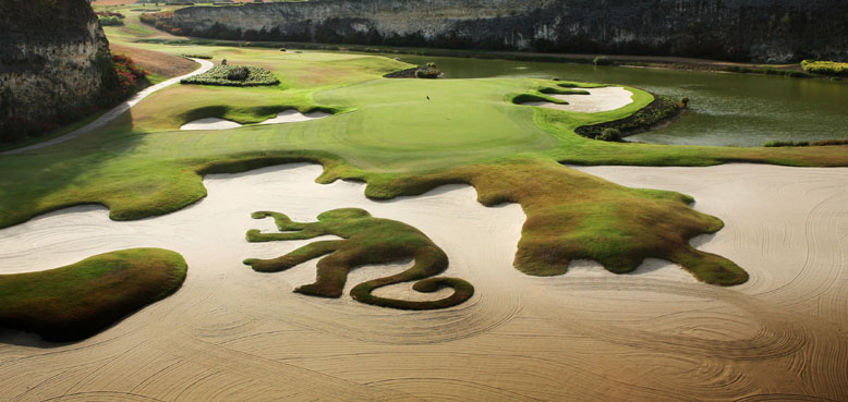 This picture is a twofer. I certainly don't like Mickey Mouse bunkers - and that was going to be a dislike, but looking at this picture got me thinking how I dislike bunkers that require a mechanical rake more. The long rake lines in the above picture are indicitive of the mechanical rake.
 The size drives up the maintenance costs by increased labor, equipment, fuel and increases the likelihood of damage.
This is a good example of where the golf hole could have looked great without any bunkers. It is competing with this naturally beautiful area.
The bunker seems to be artificially large to make room for the monkey and the excessive fingering.
Sunday, December 2, 2007
Top 10 Golf Architectural Dislikes - #1 The Flanked Driving Range

This post is a departure from the discussion of Wolf Point Club - the course this blog has been featuring - as there were several votes in the survey to the right. The idea was inspired by my friend Ian Andrew's architectural blog. This link is to a recent series that I thought was quite fun and informative - expressing dislikes is definately a common experience when visiting a course with another architect.
I am continuing his list with my dislikes - I made a list after his first day to see how they would compare - my list came out quite a bit differently.
#1 FLANKED DRIVING RANGE
A range flanked by two holes was the first dislike that came to mind. Unfortunately I didn't have any pictures, I really haven't been visiting any bad courses lately and never saw a need to photograph golf features I didn't like - I try to forget them. The above image is the first one I thought of, but I think there many examples.
A range can take up a lot of space. So much sometimes that is may be the primary item of concern when routing a course - NOT WOLF POINT. When the range is surrounded by containment mounding to separate the holes from the range, everything winds up looking like the driving range. Often it is 1 & 10 or 1 & 9 that wind up a complete bore. In general I don't find ranges to be worth the expense - I don't mind just taking one or two swings on the first tee to warm up. But if a range is best for the business plan or clients needs I like to see it on the perimeter of the property - used as a buffer for a bad view or parking.
Subscribe to:
Comments (Atom)
